Monday, November 15, 2010

Assignment 5: Tutor Feedback

Somehow this blog entry has been put off over and over again, perhaps I am reluctant to finish or more likely now that I am courses 2 and 3 in my OCA studies I have simply moved on.  However, for the sake of completeness here is a summary of my tutors feedback and my thoughts.

First of all in the light of more recent studies and development as a photographer, the content for this assignment now seems a mistake and a conceited one at that.  Prior to starting AoP my photography basically feel into 3 camps; events, still life, and most of all underwater.  I have been diving for 10 years and taking photographs underwater for 8.  This was a consuming passion, the fact that I could only dive every 6 months simply fueled the desire and planning prior to each trip.  Going on holiday became an expedition, equipment management and assembly a serious time consuming task.

In my own view I became fairly accomplished and have some images that I think I am justifiably proud of, but whether they can be called art or not is questionable.  I felt a strong need to present this aspect of my photographic development in this course and so was quite determined to submit assignment 5 based around scuba diving.  In the 8 months since then I have moved in a very different direction with my photography and suddenly underwater imaging has ceased to be the all abiding goal in my life.  This development has been driven by the OCA and for this I am very grateful and very much committed to ongoing development as a photographer and student.  Perhaps this is why I have been so reluctant to return to this blog.

In any case, the original reason for starting AoP was to develop my photographic eye and improve the quality of my underwater imagery, perhaps that predestined the subject matter for assignment 5.

On the whole the feedback was positive, the content was well balanced with the text and the structure of the document was appropriate to the subject.  Technically; "You have shown extreme competence and understanding throughout the assignment and produced images using a variety of techniques learned during the course".  This was what I was seeking to achieve with this assignment and so in a major sense I achieved the goal that I had set for myself at the start of AoP.

However, there was still some criticism, not of the individual images, but of the way in which I constructed the document.  When assembling the images for the assignment I was editing down from over 5,000 photographs to the 13 included.  I tried to select images that best illustrated learning points from the course, either composition or colour, however, I made a fundamental error in not considering how the images would sit alongside each other from a visual standpoint.  I tried to tie the images together with the commentary, however, there are two very clear examples in which I managed to heavily clash the colours.

The third page managed to place fiery reds and yellows opposite pastel pinks and purples.  From a zoological perspective these animals belong together and even from a diving point of view these two invertebrates are related, however, THE COLOURS DO NOT WORK!


A better choice for the right hand image might have been


The orange of the image would have balanced the urchins reds and the shrimp in the picture makes an interesting subject.  I wanted to use the right hand image, first of all because it is an interesting and attractive composition, but secondly the use of shallow DOF in underwater photography is unusual and is a key learning from the course.  Another alternative might have been to replace the urchin with another different species:


I appreciate that in preparing images for publication the way two images sit across a page from one another influences how each is read by a viewer.  Good Learning!

The other pair that are a little shocking were my closing images.  My tutor suggested that it would have been good to have an end of dive image here.  This thought had crossed my mind, but I struggled to find an image that I thought good enough, end of dive usually means slumping into a bar stool after a long day of equipment preparation and the concentration of taking photographs in a potentially very hostile environment. I also wanted to show a pair of images that spoke to the location.


Having said all of that the colour clash is strong.  On the whole I prefer the sunset to the lagoon shot as it shows the people of the islands heading home after work and balances with the first fishing image I used at the start of the article.  This would need a changed image for the the lagoon shot that balanced to the sunset.  The first and most obvious thing to do, would be another sunset, but with a very different look and feel.

I actually had a number of different ideas about this page, the first was to illustrate the fact that we had flown through Singapore to get there and use an image of Singapore night life as a juxtaposition to the tranquility of island life:


Although the colour clash would still have been quite strong.  The other idea would have been a second sunset, but with very different tonality or content


The second of these two photographs would have spoken to the highly volcanic nature of the region and would have balanced well with the tonality of the right hand picture.

Alternatively I could have dropped the sunset and used images that balanced well with the beach, perhaps a little documentary including the staff and the operation of the hotel.  The first of these two images is the portable bar that appeared every evening next to the pool


The second shows the dive guides relaxing after a dive


At the time of preparation all of these images were in my selection set, however, they were either too weak or too similar.

In future I will take more care to document the activities of the dive base and the people who make their living working there.

I learned a great deal from this course and it did show in my work from this trip, although, now having nearly completed People and Place my approach to my next diving trip will change to include more local life and also to be more experimental underwater.  Underwater photographers are generally obsessed with detail and sharpness, often to the exclusion of composition.  A bad photograph of a rare critter is also frequently preferred to a good photograph of a common animal.

Finally I would like to close out this comment with a note of thanks to Caroline Bloor, my tutor, for her advice and commentary during this course!

Tuesday, June 1, 2010

Assignment 5: Article

In my previous post I provided the images together with my commentary on the creation and compositional judgments made. Those images are the originals without any cropping for the final output form. In this post, the images are displayed in their final form, a photo essay:


Assignment 5

Introduction

Approaching this, my final assignment in the Art of Photography course, one thing was clear, the subject.  Usually I agonize over my selection of subject matter, this time the challenge was to select 13 images from the 5,000 plus that I took during a 3 week trip to Indonesia.  This was our third trip to dive the northern tip of the island of Sulawesi; an area that forms the southern point of the Celebes Sea, the northern part of which is formed by the shoreline of Borneo.  The Celebes Sea is one of the world’s greatest areas of marine biodiversity and is a magnet for underwater photographers, although not for the inexperienced.  North Sulawesi offers  a tremendous range of diving opportunities, in the West Bunaken National Marine Park offers hard coral, whilst Gangga in the North has Soft Coral, however, the real draw is in the East with the Macro marine life of the Lembeh Strait.  This short strip of water, 13km long by 1km wide is home to some of the most bizarre and beautiful creatures yet discovered.

With this submission I want to share the experience of diving in North Sulawesi and illustrate some of the marine life that can be seen there.  My intent was to produce the kind of photo essay that might be found in a diving magazine.  I have printed the photographs in A4 landscape on Photo paper incorporating the accompanying captions, landscape is commonly used in diving/photography periodicals, such as Wet Pixel Quarterly and X-Ray Magazine.  I have loosely bound the document to preserve the page layout and the flow of the document. If you would prefer the more normal submission of mounted prints I can provide this, just ask.

The treatment is more illustrative than narrative, however, I have tried to maintain a degree of narrative flow – I will indicate in my notes what category I think the images fall into. I will detail what element of composition I was hoping to achieve in the image.  One outcome of my study during the past year has been to move from being an underwater twitcher constantly searching for new and bizarre creatures to photograph, to thinking more about the structure of the photograph and the colour combinations it contains – I hope to convey this in the photographs.

On this trip I took two Canon EOS 40D’s, one for above water the other used solely underwater.  The above water camera is essentially a backup in case I flood the other camera, although I have to admit that if that happened I might not be so keen to risk the second camera.  Above water I carried two lenses, a 15-85mm image stabilized zoom and a 70-200mm f/4 zoom telephoto, plus a 1.4x extender.  This is a compromise forced by the weight of the scuba and underwater photography equipment, although I must say I was very happy with both lenses. 

My underwater kit centers around an Ikelite polycarbonate housing, a relatively inexpensive housing offering full camera control, but heavy.  Different lenses are accommodated by changing the front port of the housing.  As this was a predominantly macro trip I mostly used a Canon 60mm macro behind a flat port.  I did do some Wide Angle and in that case used a 10-22mm zoom behind a dome port.  Flat ports effectively magnify the image due to diffraction at the water glass boundary, which is good for small objects, but not for wide angle.  A dome port acts to preserve the angle of view. For wide angle I also added a +2 diopter as this somewhat improves edge sharpness and enables closer focus.

The main challenge in underwater photography is the same as with any other form, light.However, depth brings different challenges.  The biggest issue is that water absorbs light very selectively; most red is lost within 10m and is the reason why underwater images frequently have a strong blue cast.  This can be corrected with red filters, but only to around 10-15m deep and at the expense of 2-3 stops.  The only option is to take your own light, in my case I use a pair of Ikelite DS125 strobes.  These are moderately powerful, putting out 125J each, but even so can only effectively illuminate a subject within 1m of the camera.  This can make underwater photography of large subjects quite challenging and is one reason for the popularity of fish-eye or extreme wide angle lenses.  The other problem is getting to within 1m of a skittish animal; sharks are the worst and need much patience. A key benefit of these strobes is the fact that they can be operated either manually or with full TTL.

To place this in context, here is a photo of me underwater with this rig set up for Wide angle:


The images have all been processed in Adobe Lightroom, with a little adjustment in Photoshop, prior to being imported into Adobe In Design for the page layout.  I do not normally do a great deal of manipulation in post processing, however, with underwater images more work is needed.  First of all white balance is very hit or miss underwater, cameras simply cannot cope with the lighting – thus RAW is a given and finding a good white balance after the fact can be tricky.  The other big issue is back scatter; even the cleanest water is full of small particles, plankton, plant debris, sand, mud, and many other irritating small floating things.  These reflect strobe light very well and cause an effect called snow.  This can be minimized by careful strobe positioning, so that the light only falls on the subject and does not illuminate the water between it and the camera, very much easier said than done.  The other mitigating factor is having excellent buoyancy underwater and not kicking up the sand, sadly inexperienced divers can inadvertently ruin a good shot.  I try to stay as far away from other divers as I can.  No matter how careful, the spot removal tool inevitably gets good use in cleaning up underwater images.


Cover– Nudibranch (Illustration)
60mm, f/11, 1/125s, ISO 100

These creatures make excellent subjects as they move very slowly and are extreme in their colour variations; this one is actually quite a muted choice.  The black background has been created by choosing a narrow aperture to minimize any ambient light in the shot and ensuring that the only light registered by the camera is from the strobes.  This boosts the colour contrast and provides some nice negative space to use for the titling of my short photo essay.  I find the colour constrast between the gills (rear) and sensory organs called rhinopores (front) very striking and this contrast accentuated by the background is the dominating compositional element of the image.

Page 2 – Heidi Taking Video (Narrative)
10mm, f/8, 1/40s, ISO 100

This is the only wide angle underwater image in the sequence, and whilst not the strongest image, works very well as a narrative element.  It shows my wife taking video of a pair of Lion Fish (the image of me above was taken at this time in the same place by Heidi) and neatly illustrates the action of underwater photography.  The problem with the image is the turquoise blue of the sand in the background – caused by the slightly yellow sand and the blue light.  Any WB solution that corrected this would send the foreground bright red.  Typically wide angle imagery uses the sea as the background which we all naturally accept is blue (in reality it has no colour at all).

Page 3 – Local Fisherman (Narrative)
200mm, f/4, 1/400s, ISO 100

This image was included in part as a juxtaposition with the diving image on its left and the ability to tell a story about how important these fishermen are to the local environment; together with the fact that properly managed dive tourism really benefits the underwater environment by making it worth saving.  The distant haze caused by the high humidity blends the colour of the hills into the ocean.  This makes the colour contrast of the pink canoe far more striking.

Page 4 – Mantis Shrimp (Illustration)
60mm, f/11, 1/125s, ISO 100

These are always somewhat scary animals to photograph, as they are extremely aggressive and quite capable of inflicting serious injury or damage to the camera.  This individual was probably no more than 4 inches long, but still needed care, the giant 12 inch long specimens are best photographed outside their strike range. However, getting in close rewards the photographer with their astonishing colours and strange body structure.  This is a simple image, a portrait of a very exotic creature.
I am frequently shocked by how little some divers I meet know about the environment they are entering, few read anything and understand the aggressive and often poisonous nature of the animals living in the Lembeh Strait.

Page 5 – Octopus (Narrative)
60mm, f/8, 1/125s, ISO 100

As Sulawesi is renowned for its variety of Octopus species I wanted to include one in my narrative.  This is not the most rare or exotic (I have good photographs of Blue Rings and Mimics), but gave me chance to experiment with composition. Rather than bullseye the animal in the frame, I have placed it in a corner and deliberately used a shallow DOF (most underwater macro starts at f/22) to try and convey the sense of vulnerability that a small animal has on the open sand.  This is a case of using a single point in the composition.

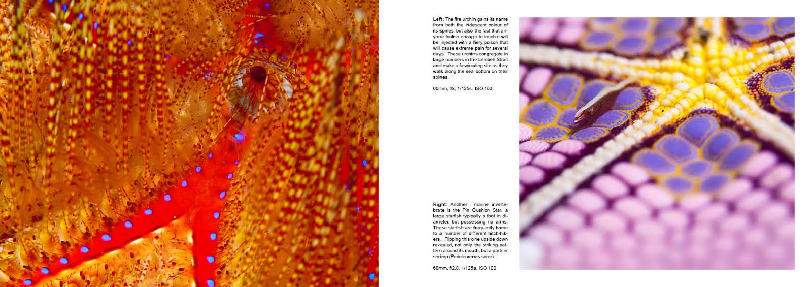
Page 6 – Fire Urchin (Illustration)
60mm, f/8, 1/125s, ISO 100

This was very much an experiment in creating an abstract composition of a natural object with vivid colours.  The blue points add direction to the photo and lead to what is actually the animals anus.  The DOF might have been higher to resolve some more detail in the spines, I am specifically trying to work with lower f-stops at present.

Page 7 – Pin Cushion Star (Narrative)
60mm, f/2.8, 1/125s, ISO 100

This is another slightly abstract image, although the Pericelemenes shrimp is considered a worthy goal for a photographer as they are less than 10mm long and move constantly at high speed.  Photographing one requires patience. Although I have a number of similar images of the underside of this sea star at higher f-stops, I have presented this one as it is an experiment in using very shallow DOF to soften the images.  As mentioned before, most underwater macro photographers are obsessed with detail and the rarity of the subject, I am now trying to get away from this and explore different styles of capture and presentation.

Page 8 – Nudibranch (Narrative)
60mm, f/16, 1/125s, ISO 100

A major goal in any nature photography should be the capture of animal behaviour and reproduction is certainly one of the most interesting.  Nudibranchs, like most marine animals lay thousands of eggs that hatch to join the Plankton, this one is no different.  The composition is suggestive of the circle of life.  I have cropped to a more or less square format, the broader image has a second similar Nudibranch in the background, but I felt this to be distracting and the square crop emphasizes the circular shape. These are my favourite underwater subjects and I spend most diving trips hunting for these tiny creatures in the coral debris. 

Page 9 – Soft Coral Crab (Illustrative)
60mm, f/10, 1/125s, ISO 100

Occasionally luck just comes along and provides a great photo opportunity.  I consider this to be the best underwater image I have ever taken.  I was able to choose an f-stop that avoided over darkening the background and thus retained the almost translucent quality of the coral and crab, but still retain some of the fine detail.  The crab is no more than 1cm long and extraordinarily hard to find.  The colour harmony and repetitive elements of the coral polyps provide compositional support to the crab.

Page 10 – Cat Fish (Narrative)
60mm, f/11, 1/125s, ISO 100

This image uses the repetition of the form and colour of the catfish as its strength.  It also provides a good talking point around the behaviour of these schooling fish.

Page 11 – Skunk Clown Fish (Illustrative)
60mm, f/8, 1/125s, ISO 100

Somewhat of a cliché especially after Finding Nemo, however, clown fish make wonderful subjects and are sufficiently difficult to photograph that getting a good close up portrait such as this is very satisfying.  They move about so much that the only effective way to get a portrait is to observe them for a short while and figure out where they like to be within their host anemone, position the camera and wait for them to enter the frame.  The shot must be taken quickly and needs instant autofocus coupled with extremely fast camera response, the reason why SLR’s are still preferred for underwater work.  In reality no one in ten shots is likely to be in focus.

Page 12 – Gangga Island (Narrative)
15mm, f/8, 1/500s, ISO 200

No diving article is ever complete without a couple of images showing what else there is to do on location.  This shows the main jetty at Gangga Island resort where we stayed for a week.  The colours of the ocean harmonize with the sky, the flags add some colour contrast. Typical of  most eco resorts in this area little can be seen of the hotel from the shoreline and all of the building is natural wood and so blends into the trees.  This leaves the jetty as the dominant man made structure in the picture, placed to comply with rule of thirds and provide a lead in to the image.  The message should be “welcome to paradise island”.

Page 13 – Sunset (Illustrative)
200mm, f/4, 1/400s, ISO 100

Not always a common site on a diving holiday as we are often underwater when the sun goes down, this shot tries to capture the drama of the tropical sky, but include the narrative element of the local fishermen heading home to their village. The overall compositional goal is to create a sense of warmth and harmony between the ocean and sky.

Friday, May 28, 2010

Project 67

Hmm, last Project in the course!

"Rain" - There are many different ways of portraying rain:

1. The threat of rain: dark storm clouds on the horizon
2. Actual rain: falling, perhaps using a long exposure
3. The impact of rain: as it splashes into the ground
4. The evidence of rain: drops on a window, a rainbow

My goal in approaching this project was to avoid photographing actual rain, but to suggest rain.  My first thought was a pair of muddy shoes dropped on dirty and wet newspaper, however, I changed my mind.  just after a re3cent rain storm I was walking past some ground covering plants with large fleshy leaves.  The leaves were covered in water drops.  Looking closely I could see that the leaves were covered in fine hairs on which the water was able to collect and form droplets.

Recently I have been doing a lot of Macro studies of plants that I found in the garden, so this fitted well with my current activities.  I gathered a few of the leaves and arranged them on my table.  A water spray created the necessary "rain" and I mounted a 100mm Macro lens on my camera.  What I wanted from this shot was a suggestion of rain in an extreme close up of the leaf that was quite abstract.

The following were all ideas around this theme:


For my chosen single image I cropped in very closely on a single leaf with just the center of the image fully in focus

Canon EOS 5D MkII, 100mm, f/8, 1/125s, ISO 100

Well that's it, all I now need to do is to finalize my Assignment 5:)

Project 66

For this project I have decided to go down the route of the still life, over which I have more control and also reflecting the recent poor weather.  I am also continuing the sub theme of Scuba diving and underwater photography that I am returning to for some of the projects in Section 7 and which will form the basis of my final assignment.

Thus my goal is to create a still life combining several elements that would make up a book cover for Underwater Photography.  The elements in my still life are a combination of diving equipment and an SLR camera - the juxtaposition being that these objects do not traditionally mix well, salt water will destroy almost any electronic device - I have killed two cameras this way.

The set up for the lighting is my pair of 400W monblocks, one reflecting off the ceiling, the other more or less straight on to the composition.  I adjusted the intensity to provide an f-stop of around f/16 to ensure that everything would be in focus.  The drawback was that this threw the background cloth into focus and I had to get creative about hiding it.  I started with a 24-105mm zoom, but switched to my 85mm f/1.8 as this provided the framing I needed and better colour/sharpness.

My first attempt was to use a pair of fins as the background with a camera and regulator (aqualung) as the foreground:


This did not work in several different ways, the fins are so large compared to the other items that they were difficult to manage in the composition.  I then moved to using a wetsuit as the background and added a yellow mask to the setup


This was better, but the chopped off name of the wetsuit manufacturer, Camaro, was distracting


Including the complete logo created a problem that there was now too much negative space in the upper part of the image.  As this was designed to be a book cover illustration some negative space is needed for the title, but not this much.

In my next attempt I moved to a portrait setting and tried to remove the logo


Boring, another try provided the following


This I liked, the yellow hose adds a lead line, there is plenty of space for a title and the composition is reasonably balanced.  I thought to stop at this stage, but concluded that the camera is not prominent enough, it is fading into the black background.

I also did not really like the mask, the regulator and hose provided the flash of colour I wanted, the yellow on the mask was too different in tone.  I removed this and moved back to a landscape framing;


This image is without the wetsuit as a background, the lack of smoothness in the backing cloth is distracting.  However, I like the repetition of the circular elements and the greater visibility of the camera through the "Canon" logo. Next try was to put the wetsuit back:


I actually like the addition of the yellow in the suit, but it removes any possibility for titling, so next attempt was to get the yellow lower in the frame


Whilst this is better, I now find the yellow in the suit to be distracting and having a brighter background than foreground is unsettling in the image

In my next and final image I have retained some of the yellow in the suit, but positioned in a way that it better harmonizes with the yellow hose.  I have also pulled the viewpoint down and gotten a little closer.  What I have done is to create a diagonal with the camera cap and regulators, with a Triangle of black to enable the addition of the book title:

Canon EOS 5D MkII, 85mm, f/11, 1/125s, ISO 100

Tuesday, May 25, 2010

Project 65

Concepts and Symbols

Growth

  • Plant Shoot: Photograph a shoot just breaking through the earth, accentuating the green coloring to emphasize new growth
  • Two Siblings: Standing side by side with their backs against a wall two similarly dressed siblings of the same sex, but very differing heights would suggest growth.  The shot should be as simple as possible making the difference in growth the key point in the image
  • Skyscraper: Shot from the very bottom directly upwards a tall building can suggest growth
Excess
  • Cup or Glass: Filling a cup or glass until it visibly overflows.  This would require careful lighting
  • Pile of Money or Jewelry: Still life composition isolating the subject against a black background
  • Bottles: The excess of drinking could be suggested by arranging several empty booze bottles preferably in a gutter
  • Car: In these times, a shot of an expensive luxury car in front of a bank would work.  A forced perspective using a wide angle at very close range to over emphasize the size of the car would accentuate the effect
Crime
  • Broken Window: Shot late in the day or in very low light, a broken window suggests evidence of crime
  • Barred Window: Positioning a person in orange clothing looking disconsolately through the bars would suggest the consequence of crime
  • Handcuffs: Simply arranged with a black background
  • Police: Taking care not to fall foul of any new laws constraining freedom to photograph, an image of a policeman walking the beat suggests crime, although this may be better for security from crime
Silence:
  • Nuns/monks: An image of a Nuns or Monks walking in a cloister
  • Library: An image of people studying in a library
  • Speak no evil: A simple portrait of someone standing face on to the camera with their hand over their mouth
  • Bell: Somewhat comprised, but a photo from below a bell, but with the clapper wrapped in cotton wool suggests silence
Poverty:
  • Down and Out: The simplest shot would be of someone sleeping rough or begging - preferably looking disheveled.  Would be careful to ask and offer the price of a cup of tea for their help.
  • Derelict Housing: or even poor quality social housing.  A shot of a house with furniture on the front lawn is a common American symbol of poverty - tricky to find and care needed
  • Documents: A P45 or Pink slip convey impending poverty - still life
  • Piggy Bank: A smashed piggy bank with a few coins next to it - still life

Project 64

After dwelling on this brief for a while I decided to take advantage of a happy co-incidence between my wife baking a birthday cake for her sister and myself working up some Macro imagery of plants from our garden.

This meant that I had my studio set up for close up photography and possession of some interesting objects to photograph.  As a result the "action", I am illustrating is the baking of a cake.  To keep the composition simple I kept the composition simple, sprinkling some flour on a bread board and then arranging a broken egg shell and the parts of a cake mixer:

EOS 5D Mk II, 100mm Macro, f/6.7, 1/125s, ISO 100

Lighting was provided by a pair of 400J mono-blocks in soft boxes.  I aimed one to bounce of a white ceiling providing a soft fill light and the other to the left of the composition as a main light.  The key photographic question then was composition and arrangement.  I have tried to have a strong diagonal together with the softer repetition of the egg shell, the low depth of field combined with extreme close up helping.

The selected photo was one of a sequence I created using a variety of angles and slight variations on the composition.  As I had dusted the board with flour moving the objects around too much created distracting lines in the flour.


Top down simple angle, felt this was too obvious

This was better, but I wanted more emphasis on the shiny metal of the mixer blades


Moving to the other side, this composition lacked any dynamic, but started my thoughts around how the final view would look emphasizing the blades


Dropping down and getting closer the image starts to get more interesting, but the out of focus foreground and poor background made this a reject


Getting in a little closer this was a close candidate, but the eggs are not so obvious and I felt this to be too abstract