Monday, September 28, 2009

Assignment 1: First Thoughts

Phew, first 15 projects completed in just 3 weeks, a lot of work and late nights, but great exercises.  If nothing else this course is forcing me to address new topics and getting me out and about to interact with the city.  I now have 3 weeks to develop and execute my ideas for the first assignment: "The Theory and Practice of Contrasts".

Whilst working the projects I have maintained a notebook, jotting down ideas and possible themes as I went about the exercises.  My overriding thought is that the image pairs should relate strongly to each other, not simply reflect the contrasting properties, e.g. a curved road versus a straight pencil.  On the other hand a unifying theme that links the subject matter of all of the images would be very limiting and possibly lead to a very monotonous submission.

After a great deal of thought, I have arrived at the conclusion that this is not a treasure hunt for subjects that act as good metaphors for the topics listed in the text, but should be a test in using the medium of photography to discover in the subject the contrasts requested.

Photography offers a number of degrees of freedom in how an image is created, some of these are technical, some environmental, with others provided by image production process itself:

Technical - The Camera
  1. Shutter Speed
  2. Aperture
  3. ISO
  4. Focal Length
  5. Magnification (in the case of Macro Lenses)
  6. Flash
  7. Exposure Compensation
Environmental
  1. Vantage Point
  2. Ambient Lighting
  3. Background
  4. Movement - Subject or Photographer
  5. Elapsed Time
  6. Location
  7. Context - Tricky, but an object can impart contrast based on its history
Production
  1. Cropping
  2. Colour Management
  3. Black and White
  4. Print Medium - different papers, card stock, ...
  5. Display and Mounting
The challenge that I have set myself is to produce pairs of images that have the same subject, but impart the contrast through one (or more) of the degrees of freedom listed above.


"The Contrast should originate from the act of Photography, not simply from the innate property of the Subject"

To help in working these ideas I have been sketching a few of them:


As I now have quite a few ideas and not a great deal of time to work on them (3 weekends left, 1 to be spent visiting family in UK, so effectively lost to this process), I have prepared a spredsheet to summarize ideas and track progress.  Sadly this blog only supports picture uploads so had to print and then scan this:


Museum Visit: Pinakothek der Modern

Munich has three main art galleries, all within a block of each other and all named "Pinakothek":

Alte Pinakothek: Art from the 14th-18th centuries
Neue Pinakothek: Art from the 19th century
Pinakothek der Modern: Art and design from the 20th and 21st centuries

This weekend I headed over the the third of these museums for a short visit, simply to check out the scope of the collection, as I only had a short time to spend there.  I plan to return when I have more time and explore the different themes of the museum in more detail.

This museum is just opposite the Brandhorst Museum used as the subject for my photos in Project 3:

http://sclarke-blog.blogspot.com/2009/09/project-3.html

From an exterior standpoint they could not be more different, the Brandhorst is extravagently colored, whilst the Pinakothek der Modern is very austere:


However, both museums share one thing in common, spectacular internal architecture. This is the ceiling dome of the ticket hall and entrance:


In both cases the museums house great art collections, but also provide the photographer with fabulous subject matter and inspiration.  The museum divides into roughly 4 sections, modern art, architecture, design, and space for two temporary exhibitions.  On the day I visited there was a photography exhibition presenting the works of Gerrit Engel an architect and photographer.  The exhibition presented a number of series of images of buildings from New York and Berlin, grouped in rectangluar blocks of photographs:


All images were taken on cloudy days with white flat backgrounds to focus attention on the buildings.  The images were superbly executed and the geometrical presentation very striking, however, the overall impression was flat.  Although all of the images were in colour they lacked any impact and perhaps would have been more impressive in a stark black and white format.

I then spent a little time in the Classical Modernism section, in particular to see the works by the Bauhaus school, such as Paul Klee a former teacher at the Bauhaus, having just studied one of Johannes Itten's books


The geometric arrangement and harmonizing colours have always interested me, I have a Klee print on the wall at home, so having an opportunity to study the real thing was very satisfying.  The collection houses many other paintings by Picasso, Dali, and Warhol, among others, however, on this visit the single most impressive work was far removed from paint and paper.  The following two images are of a work by Dan Flavin, created from colored strip lighting:


The entire room was bathed in green light, a fascinating object to photograph!

The other part of the museum I briefly visited was the design exhibit in the basement, not only a study of design, but a design statement in its own right.  The stairs leading down to the basement open onto the following exhibit


My final image from this short trip was a radial aero engine, very stark in its simple and yet complex symmetry


Once again I have used a museum visit, originally intended to broaden my knowledge of art as a photographic investigation of the shapes and forms that I found there.  Perhaps this is a good way to develop my eye?

Book Report: Design and Form - Johannes Itten


This book is a summary of the introductory course at the Bauhaus in Weimar, Germany originally given in the 1920's and written in 1963.  Although, now nearly 90 years have passed since this course was first presented to students the basic theories and ideas developed remain with us.  Indeed, many aspects of the Art of Photography course have inspiration from this blueprint in art education.  The book intersperses Itten's thoughts on the creative process with practical examples created by former students as they attended the course.

The influence of Itten and the Bauhaus was brought home this weekend when I visited the Munich Modernist Pinakothek, the cities principal museum of modern art and design.  Many former students and teachers had works presented centrally within the Museum.

Itten was very much influenced by Eastern ideas on relaxation and focus of the mind, many exercises began with meditation, rhythmic motions and breathing, to put students into the right frame to begin the creative process.  Modern books on photography, particularly underwater photography also propose such techniques. I find them of great value, and prior most dives I spend a few minutes on the boat emptying my mind and attempting to visualize the images I will attempt to create.

The book divides into several sections, each building on the other:

1. Chiaroscuro - the contrast between light and dark, a study and exercises in the graduation of tone between pure white and complete black.  He proposes taking famous images from the art world and reducing them to tonal areas of gray.
2. The theory of colours - essentially an introduction to the concept of colour that he expands on in "The Elements of Color".  This develops the idea of the colour wheel and how different colours harmonize or contrast.
3. Material and Texture Studies - Here students are encouraged to gather and combine different materials and textures and illustrate them in ways that drive to the essence rather than simply reproduce the form.  Very much a study of contrasts and one with a challenge to photographers, how do you reproduce photographically the sense of something, going beyond colour and shape.
4. The Theory and Practice of Forms - He expands on the concept of lines, triangles, circles, and squares, how they combine in composition, in particular how shapes can be used to tile a plane.  Of value to me were the examples in the use of points and lines and how different compositions can lead the eye to a single point or leave the viewer continually moving from one place to another.
5. Rhythm - This is explained both as a study in repetition, but also the representation of flowing movements.  Exercises set for the students include drawing musical forms, i.e. listening to music and finding a pictorial representation.

He concludes with Subjective Forms, the idea that all people, however, talented in art, have within them a style specific to themselves.  Much of the course is an exploration of that subjective style through a series of exercises to build skills, but explore personal expression.

I have found it very difficult to summarize this work, I find it at the same time inspirational and baffling.  I guess a weekend studying this book is not enough, I suspect I will return time and again to this small volume learning more and more from it as the course progresses.  I must say that this is an almost ideal companion volume to this course.

Project 15

For the final project in "The Frame", I have chosen to dip into my archive and select 3 photo's from a trip to New York last year.  I have been to New York a few times and find that the photo's I take are always very busy, whether at street level or from a remote vantage, and so I always have to crop a little before printing.  I pulled 12 shots over a variety of subjects, worked out crops for all and then selected what I thought were the most interesting.  First of all here are the before and after sheets for each of the images:


When I originally took the photo below I was caught by the striking red colour and layers created by the gradually higher buildings.  I could not frame the building as I wished, not enough focal length, thus cropping was necessary to present the image as I saw it at the time.  The tree and the sky detract from the image and so I have removed most of this, I also wanted to place the red building more centrally to give it greater prominence.


This was a group of South American musicians playing in the Times Square neighbourhood.  By tightening the image there is greater emphasis on the musicians and less on the skyscrapers behind.  I feel this also places them deeper into the urban environment. The foreground is too dark, something that would have been improved by my leaving the sky out in the first place and achieving a better exposure for the main subject of the image.


My final selection was taken from the Staten Island Ferry looking back at the financial district of Manhattan Island.  The initial image is fine, however, there is too much ocean in the foreground, negative space that adds nothing to the composition.  Deciding on whether to crop the sky was harder as it adds colour punch to the image.  However, by reducing the sky I have been able to emphasize the buildings on the right side of the image and provide a panorama style format that suits the New York skyline from this vantage point.


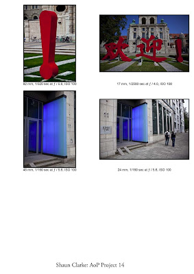
Project 14

I found this an odd project to work, I have never had an issue with horizontal versus vertical framing, in fact I frequently prefer a vertical frame.  I even find myself interjecting with friends shooting people in a horizontal frame with point and shoot cameras and asking them to think about a vertical frame, particularly with only one person in the shot.

However, any excuse to get out with my camera and take a sequence of shots for comparison.  For this exercise I selected a walking route that we frequently take on a Sunday morning that drops through the cities main park, loops into the centre and then heads home along Prinzregentenstrasse, one of Munich's primary arteries and where several museums are located.

After taking the shots and arranging them into pairs I started to notice a pattern in the shots, with a vertical frame I have a distinct tendency to get closer to the subject and attempt to fill the frame, with a horizontal shot I tend to back away, broaden the scope of the image, and include more sky/background.  This could be happening because my first subjects had a vertical nature that suited a portrait shot, when I then took a landscape shot I had to back out to ensure that the subject was not cut off top or bottom.  The other noticeable trait with the horizontally framed photos was that I placed the vertical element into the side of the shot, whilst with the vertical framing I tended to place the subject centrally in the frame.

Here are contact prints of the 20 vertical and horizontal shots arranged side by side for comparison:


Sunday, September 27, 2009

Project 13

Once again I selected 6 images from my travels around Munich - getting a lot of exercise as a result of this course!  In each case I looked to work with the Golden Ratio or Rule of Thirds.  First the images without markup:


In each case I have printed them again and marked up the image with the golden section to show how they conform to that concept


It is definitely the case that the Golden section adds an edge to the shots.  In the case of the top middle image I had an alternate with the statue in the middle of the frame, moving the subject to the right has added interest, but also an area of negative space that pushes the viewers eye towards the eyeline of the statue.

This is an interesting exercise, one I recall from school art courses, but also through the application of the Rule of Thirds in much of my photography.  A question it raises for me, though is the lack of practical application of this ratio in the real world of imaging. In terms of the ratio of sides:

Golden Ratio: 0.62
Rule of Thirds: 0.67
35mm digital image: 0.67
Typical Snapshot Camera or 4/3 format: 0.75
Widescreen TV 16:9: 0.56
My computer screen: 0.67
A4 Paper: 0.71

It seems that 0.67 has become a more common standard, at least for photography, but generally the golden section not used as a standard form factor.  I agree that whilst it does provide a pleasant image, challenging this ratio and creating tension by breaking the rules has its attractions.

Project 12

This was going to be a tough one, living in a city distant horizons are non-existent.  Even if I had the time and facility to head out into the countryside, the surroundings of Munich are mostly either hills or woods, horizon lines are rare.  From many trips to the tropics I have had plenty of time to experiment with placing the horizon, trying to balance reef, sun , and sea.  However, for this course a horizon needed to be found in the city.  I had two ideas, first to use an artificial horizon created by buildings and then use a road to provide a foreground without too much clutter.

The following sequence was taken from a traffic island in the middle of Ludwig Strasse looking north and taking in the buildings of the University


The second image in this sequence with the high horizon is the most striking.  However, at 17mm the foreground is far too prominent and the buildings too small, this would have worked better with an intermediate telephoto around 100mm.

The second sequence is from a bridge on the Isar river, the horizon being provided by a bridge downstream:


In this case the final image in the sequence works best, but I cannot say I am happy with the exposures or the green colour caste, naturally formed as the water is very green with algae this late in the year.

In both cases the images lack foreground detail to compensate for the lack of detail in the background.  In both cases the horizon works best either low or high.

To finish this project, I would like to provide a few images taken during my vacation in August, each using the horizon as a prominent element in the composition.  The first is a very simple image, a study of the colours of the sea and sand.  I have placed the horizon more or according to the rule of thirds:


The next image pushes the horizon close to the bottom of the image, emphasizing the threatening nature of the incoming storm:


Alternatively, in the next image I have pushed the horizon up to the top of the image.  In this case I could have composed without the horizon, however, it acts to emphasize the loneliness of the subject in the vastness of the ocean:


Finally, on a rare day when the wind stopped blowing and we could see the Sun, this early morning image places the horizon at the centre balancing the light of the Sun and the reflection in the water, but taking away any drama from the image:


Project 11

The 6 images I selected for this project were taken during the past 3 weeks as I wandered around Munich looking for subjects and inspiration.  I have tried to select a variety of subject types with a range of balance challenges from easy to difficult - very subjective process I am afraid.  First of all here are the 6 images prior to any analysis


I printed these in groups of 3 on card and then marked up in red the areas of each image that provide the weights for the balance.  To the right I have sketched how I see the picture balance - fun project!


Image 1: This was a very cluttered image, more or less a grab shot taken as I walked through the Hofgarten.  The question was how to divide the many components, in the end I concluded that the pale building to the left balanced with the trees to the right.

Image 2: OK an easy one, memorial markers on the side of Munich's cathedral formed nice geometric shapes in the image, the large memorial to the left balancing the two smaller to the right

Image 3: At the side of the "Haus der Kunst" art gallery posters announcing a forthcoming exhibition by Ai Weiwei line the façade.  The poster balances against the line of tress to the left

Image 4: I included this as a challenge to myself, how to balance a surfer in a portrait framing.  The shot looks balanced, possibly by the dynamic of the implied movement.  However, by looking at the key interaction points, the hand in the water to the left balances with the surf board to the right.  The surfers body then provides a large central element.  Good implied lines here as well!

Image 5: Another challenge to self. This fish is on a fountain in Munich's central square opposite the town hall and if asked to meet at the fish everyone in Munich knows this is the location.  Here the bulk of the fish is balanced by the detail of the water spout and hand in the bottom right corner of the image.

Image 6: Another very cluttered image taken at Odeons Platz, Munichs central war memorial.  This is the location for a famous image of a young Adolf Hitler celebrating the outbreak of WW1 in 1914. When I took the image I was trying to dramatize the lion, but still include the church in the background.   from a balance point of view the Lion is countered by the bulk of the church.

To finish this project here is my viewpoint on the balance of the images in the course book.


Project 10

Munich is blessed with a wide variety of monumental architecture, frequently situated in wide open places to accentuate the grandeur of the subject.  For this project I selected a statue of Maximilian I Joseph, one of the kings of Bavaria, prior to Bavaria's inclusion as part of the modern state of Germany. As an aside the statue was put in place 10 years after he died, after he opposed it as he felt it was not regal enough!

The useful aspect of this statue is that it is situated in the middle of a large open square opposite the Residenz (Royal Palace) with the Opera house behind it and the old post office to the right.  I had a good 30m in which to work.  I started with a 200mm telephoto and then progressively moved in shortening the focal length.  In the sequence below I have included 3 images rather than 2, as the final image did not work, but illustrates a problem with very wide lenses.  At 200mm the statue is well proportioned and the background nearly fills the frame.  As I closed on the subject the background starts to recede as I am forced to tilt the camera upwards to fill the image.  At 38mm the statue has become much more dominant in the frame and the back lighting from the sky is starting to darken the image, I could have compensated better for this or used fill flash.  Beyond this I started to get too close to the subject to be able to frame the statue, at 17mm I was no more than 1m from the pedestal and the statue is no longer properly visible.  However, this is also an interesting image in its own right, the forced perspective giving the lion prominence and highlighting the detail around the base.  In each case I tried to keep the kings hand in the same position in the frame and include the pedestal.


For this subject the telephoto does the best job, providing a better proportioned image of the subject and enabling the architecture of the opera house to become a part of the image.  A better angle would work here, however, due to the upcoming Oktoberfest parade part of the platz was blocked by temporary seating.  The extreme wide angle of 17mm also creates a very dramatic image, but, again a better angle completely omitting the need to include the king would allow a better study of the lion and detail around the pedestal base.

My final image in this project shows the statue in its place in the Max-Joseph Platz, with a group of Chinese tourists having fun taking photo's!


Project 9

For Project 9 I was running short on time and had to make do with heading into my back garden and taking a few shots there, rather than go down town to find a more interesting subject.

We share a garden with multiple houses and so there is a long uninterrupted view onto a small wooden house provided for the local kids to play in. I found a good position for the tripod and selected two lenses to give me a wide range of focal lengths to play with, a 24-105mm zoom and a 100-400mm zoom, so a 16:1 maximum ratio.  Here are the results at 24mm, 50mm, 100mm, 200mm, 300mm, and 400mm:


Looking carefully at the images the perspective does not shift as the focal length changes.  As the light path for the photons reflected by the subject does not change and the lens is rectilinear, the lens is imaging the same incident light in each case.

From a viewpoint perspective the most attractive image is the 200mm.  Prior to this there is too much negative space in the foreground and the background is very cluttered.  Beyond 200mm the small house is too dominant in the frame.  At 200mm the background is almost completely green hiding the fact that this is an image created in the heart of an apartment complex, we could almost be in the heart of a forest.  The downside is that the exercise has made a bullseye out of the house, a crop to an effective focal length of 250mm would allow some compositional control, such as the following


Book Report: The Photographers Eye - John Szarkowski


I found this book in one of Munich's art galleries, just after enrolling on the course.  This is a reprint of a book initially published to accompany a 1964 exhibition in The Museum of Modern Art in New York. The objective of the exhibition and book is to explore the interaction between the fine art and functional traditions of photography, in other words what photographs look like and why they look that way.  It reviews the history of photography, primarily through images and asks questions about how photographic composition evolved and influenced the way that we look at the world around us.  The images in the book also divide between known and sometimes famous photographers and cases in which the photographer is unknown.

The book divides the images into 5 categories:

The Thing Itself - in other words the fact that a photograph is a direct representation of what lies before the camera lens. However, the sheer reality of the photograph can obscure the overall context of the image by placing the emphasis on the subject and ultimately the photograph becomes the reality as it will outlast the subject.  A quote by Gerogre Bernard Shaw sums this up:

"There is a terrible truthfulness about photography.  The ordinary academician gets hold of a pretty model, paints her as well as he can, calls her Juliet and puts a nice verse from Shakespeare underneath.  The photographer finds the same pretty girl, dresses her up and photographs her, and calls her Juliet, but somehow it is no good - it is still Miss Wilkins, the model.  It is too true to be Juliet."
Wilson's Photographic Magazine, LVI, 1909.

In this section there are a number of images by Russel Lee of primarily domestic scenes, which .  The first, Russell Lee: Tenant Purchase Clients at Home, Hidalgo, Texas, 1939., depicts two middle class americans sitting by a radio, the man reading a paper, his wife doing some handiwork.

http://alkek.library.txstate.edu/swwc/wg/exhibits/rlee/images/WG140.jpg

The symmetry of the image and the starkness of the home are almost brutal and whatever the feelings in the house, the image carries away tension and unhappiness.

The Detail - A photographer is limited by the facts of the scene as they find it, a story cannot be created by a photograph, it can only record the detail of what is actually there.  This suggests that although a photograph records the simple details in life, by doing so it gives them greater meaning and allows deeper examination of the seemingly trivial.  A quote from Robert Capa, the war photographer, expresses this: "If your pictures aren't good, you're not close enough".

The first image in this section is seemingly the opposite of this idea, it is a back and white image of a shallow valley devoid of any detail other than a scattering of rocks.  The clue in in the title: Roger Fenton, The Valley of the Shadow of Death, Crimea, 1855. At close glance many of the rocks are actually spheres, cannon balls.  This is a valley blasted by cannon fire, probably the last place many men and horses ever saw. Only in this small detail does the image have any meaning and then its detail conveys all the horror that has been cleaned from the scene.

http://memory.loc.gov/service/pnp/cph/3g00000/3g09000/3g09200/3g09217r.jpg

The Frame - the frame defines the scope of a photograph and what it includes, but perhaps more importantly what it excludes.  The photograph preserves only what it captures, all else is discarded and the context of the scene is defined for ever after by the Photographers vision at the very moment of exposure.  The book also comments on the fact that early photographs were often very full with the subject often crowding the edges of the image, these guys had no access to cropping tools, enlargers, photoshop, an expensive plate needed to be used to its fullness.  This resulted in many very crowded early photos.

Two photographs captured my imagination.  In the first by an unknown photographer in 1910 (no link), two society ladies pose for an image at what is clearly a major event, judging by the hats.  Strangely the photographer has placed them low in the frame, the brims of their hats only extend upwards to a third of the frane.  In the upper two thirds a naked statue presents its posterior, clearly a visual joke created by a subtle repositioning of the frame - I cannot imagine the ladies in question would have been too impressed.

The second image also involves a very selective use of the frame- Elliott Erwitt: Yale's Oldest Living Graduate, 1956.  Breaking many of the "rules" of composition, this image captures the rear of a large 50's US automobile, in which sits an elderly gentleman at the very right edge of the frame.  This positioing makes him look very uncomfortable and the strong impression is of someone not wanting to be there, purely projected by the framing.
http://hoodmuseum.dartmouth.edu/docs/04-09-09%20sfd%2050%20broch%20edit.pdf

Time - No photograph is a instant in time, all have a finite exposure, long or short.  However all photographs are taken in the present and define that moment, the goal of all photographers is the capture in Cartier bressons wors, "The Decisive Moment".  The book also articulates the fact that the ability of the photograph to "freeze" time revealed for the first time the motion of birds and animals, in particular revealing a horses motion.  Prior to photography all horses were painted with straight legs, only after the first high speed images did people understand the gait and posture of a galloping horse.

The other aspect of time captured is that moment when things change a gunshot, a speech, a gesture, changing a persons life or even history.  The following image (photographer unknown), shows a concentration camp inmate identifying a guard to the authorities in 1945, bringing justice, but forever changing two lives.

http://www.flickr.com/photos/joh/3587653801/

Vantage Point - The use of photographic equipment and the immediacy of taking an image have resulted in the exploration of new perspectives, sometimes forced by constraints of equipment, but also through the liberation that a camera brings.  Photographers were frequently limited by the access options available and started to image scenes, such as back stage at an event, that would be ignored by a conventional artist.  The exploration made possible has changed the way that we look at reality.

My Final seclection from the book is an unusual perspective of a woman taken from vertically above as she sleeps face down in bed, illustrating the change in vantage point that a camera provides.  Irving Penn: Woman in Bed, 1941 (for Vogue).

http://img2.visualizeus.com/thumbs/09/07/02/bed,dreaming,irving,penn,sleeping,woman-73b0631737e785ec5d8b7cc926ff5d2d_h.jpg

As a final comment I quote John Szarkowski's closing words: " The history of photography has been less a journey than a growth.  Its movement has not been linear and consecutive, but centrifugal.  Photography and our understanding of it, has spread from a center; it has by infusion, penetrated our conciousness.  Like an organism, photography was born whole.  It is in our progressive discovery of it that its history lies."

We all contribute, photography is art for the masses!

Museum Visit: Egyptian Art Museum

Possibly not the most obvious source for inspiration to a Photography student, the Egyptian Art Museum was nevertheless an interesting destination for a budding photog.  This fairly small museum houses a good variety of sculpture and murals/wall carvings from a broad span of Egyptian history. Dating from around 5,000 to 2,000 years old the sculptures clearly show the development in the representation of the human form, from representative through to highly realistic.  Other than the simple pleasure of examining the work of artists from many years ago the museum's policy of photography, but no flash, presented a great opportunity to do some low light portrait work.  The fact that the subjects were totally unmoving was a definite advantage, although not being able to use any fill flash meant that shadows would be a potential problem. 

I have selected 6 shots to chronicle my visit to the museum.  Although these are off topic for the overall AoP course, my intent to visit a new gallery/museum each week is inspired by the course and intended to help me to develop ideas and subject matter.  I selected my 50mm f/1.2 for this series, the low aperture and great optics are well suited to the subject, although the lack of Image Stabilisation was going to require careful attention to shutter speed.  The key selling point of this lens, a maximum aperture of f/1.2, is also its achilles heal as the depth of field when wide open is wafer thin and without a tripod (not allowed in most muesuems)is very hard to manage.  Thus I rarely use the maximum aperture, but even f/2 is much better than my f/4 zooms.

The first 4 shots are a series of heads moving forward in time to illustrate how the presentation of the human form developed in realism.


50mm, 1/60s, f/2.8, ISO 800


50mm, 1/250s, f/2, ISO 800


50mm, 1/200s, f/2.8, ISO 400


50mm, 1/100s, f/2.8, ISO 400

The next image was my personal favorite piece in the museum, a huge lion head.  Unfortunately no matter what I did I could not eliminate the huge shadow cast by the nose At least not without significant amounts of Photoshop intervention), but I still like the image:


50mm, 1/100s, f/2.8, ISO 800

The final image is the most striking.  It is a gold leaf covered wooden face mask taken from a burial.  The lighting was very low and atmospheric to accentuate the colours and added a sense of mystery.  I experimented a little with this image, in the end opting for a -2 step underexposure to darken the background, but still allow the quality of the gold to come through.  With less exposure compensation the glare from the refelction on the face started to overpower the image


50mm, 1/640, f/2, ISO 800